Need to know

For #TeamEEAST Last updated: 05 May 2024 at 08:21

Here at EEAST, all of our documents, both internal and external, have to go through an accessibility check, including a colour contrast test. Below is a brief introduction to the colour contrast checking process and the reasons why you need to think about this when producing any document.
Colour contrast is one of the most important aspects of accessibility. It ensures that foreground features of a document are in contrast to the background to achieve maximum clarity and ease of reading. This is important as it allows individuals with certain kinds of visual impairments to access all the same information they need to without undue strain. We use a simple online tool to help us determine if pairs of colours are sufficiently contrasting.
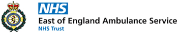
WebAIM: Contrast Checker allows us to input a foreground and background colour, and the system then automatically tells us if the pairing passes for normal text (size 12/14), large text (size 16 up), and graphic objects. For text, the levels of passing are also split into AA and AAA, with AAA being the highest level of contrast and therefore the most accessible.
Below are two examples of colour pairings, one of which passes across the board, and another which fails on a few aspects.
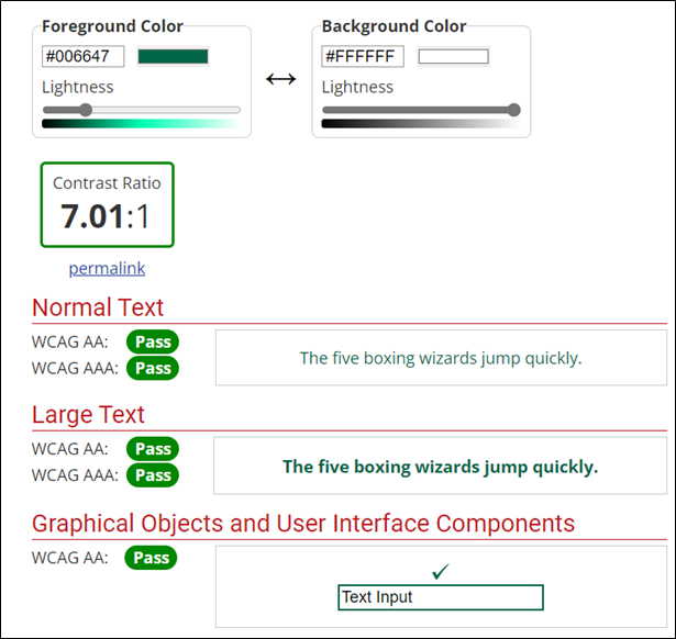
As you can see, the tool has a very clear pass/fail icon that lets us easily see whether or not a colour pairing is appropriate for use on Trust documents.
All colours used in EEAST Trust documents, both internal and external, must pass at a minimum AA rating across all three tests, otherwise the document will fail accessibility checks. Where possible, we should always aim for AAA rating (only applicable to text), but we recognise that this may not always be an option.
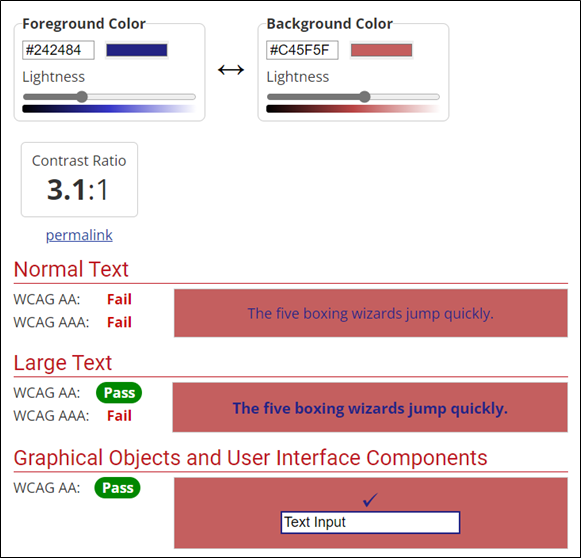
You may notice that the Hex codes for each colour are visible in the tool. This is the most accurate way to enter your colours into the tool when doing a contrast check.
If you click on the colour box next to the hex code, you will be given the option to enter RGB values of a colour, which is also accurate, or use a picker tool. Please refrain from using the picker tool as it is unreliable and inaccurate.
In order to try and speed up the process of colour contrast checking, we have run all of the checks on NHS and EEAST brand colours and put together a reference document with the results. That document is linked below.
For colours outside of the brand guidelines, individual checks will still need to be run.
If you have any further questions regarding accessibility or colour contrast, please contact our Web Accessibility Officer, Sean Bennett, at sean.bennett@eastamb.nhs.uk
Published 10th March 2022