Need to know

For #TeamEEAST Last updated: 02 May 2024 at 00:37
Alternative text, sometimes called alt text, is a type of descriptive text that we use to explain images to those who cannot see them. It’s an easy but vital part of our accessibility toolkit, because it allows those who use screen readers to still access the full range of information available in documents.
Most of the software we use here at EEAST (Microsoft office, adobe, etc.) has in-built alt text tools, making the process of adding it pretty easy.
In Microsoft office tools, all you have to do is simply right-click on an image, select ‘edit alt text’ from the drop-down menu, and then add the text in the pop-up box.
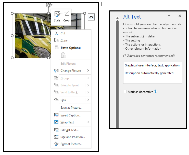
There may be automatically generated alt-text in the box. This is produced by word and is never correct or worth keeping. Always replace the generated text with your own.
It’s important that alt-text is written in a certain way. The idea is to describe the important details of an image comprehensively without including any flowery language or unnecessary detail.
Take a look at the example below.
Which one do you think is the correct alt-text for the image?
Scroll down for the answer.
.
.
.
.
.
.
.
.
.
.
.
.
.
.
.
.
.
.
.
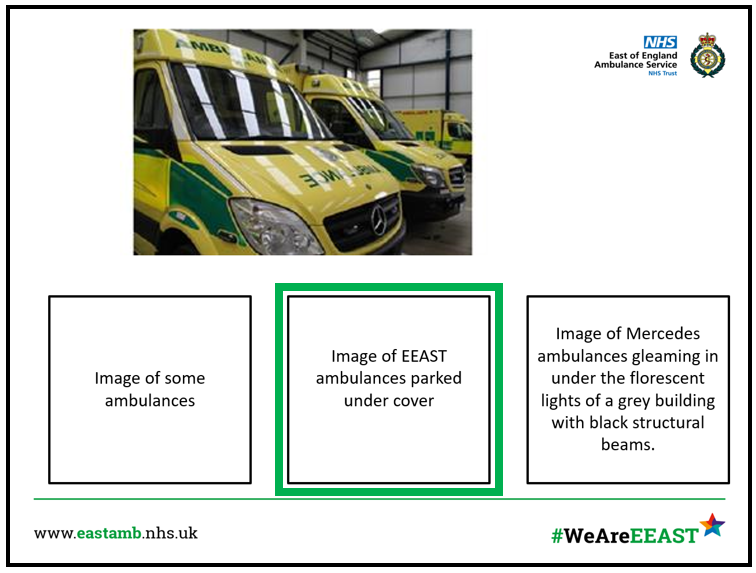
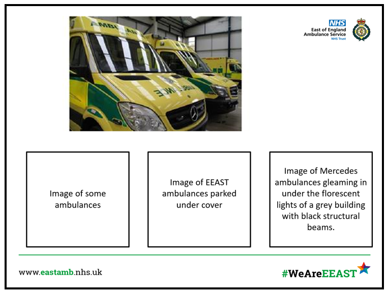
Let’s talk through the answers.
The first option is too simple and leaves a lot of room for interpretation that could be wrong or counter-productive to the documents. A person hearing the alt-text won’t know anything about the context of the picture, and so wont be able to get any information that would actually add to the document they are reading.
The second option is perfect. It offers a simple description of the image, contextualised enough to ensure that anyone using a screen reader will be able to get a good idea of what’s going on in the image. The features that have been picked out (EEAST, Parked, Under cover) are enough to paint a clear picture, without going into so much detail that the flow of the document will be disrupted and the reader becomes lost.
The third option is simply too long and complex. All of the details in it are true, but the flowery language and artistic description offers more detail that could be reasonably required and the text is so long that it could easily break the flow of a screen reader and make it very hard for the listener to keep track of what’s going on.
All images used on Trust websites and documents must have alt text. Without it, we fail to meet our accessibility responsibilities and could get reported to the European Court of Human Rights.
It is absolutely vital that alt-text becomes a universal tool that we all use at EEAST, not only so that we can meet our legal requirements, but also so that we can create an environment that is accessible to all.
If you have any questions about this or any other web accessibility related topics, please take a look at the Trust Accessibility Support page. If you can’t find the answers you are looking for there, please feel free to contact the EEAST Web Accessibility Officer, Sean Bennett, at sean.bennett@eastamb.nhs.uk
Published 5th July 2022